
After launching this Journal a few weeks ago, I realized that I was beginning to diverge from the simplicity I so highly valued on my site. I now had Thoughts and Reflections, Essays and Journals, Poems and Marginalia.
I found myself feeling more and more suffocated by the complexity. Should I publish this as an Essay or a Reflection? What if the writing was informative but not reflective? Do all my Reflections need to be reflective? Do all my Essays need to be long?
Leonardo Da Vinci said that simplicity is the ultimate sophistication. I think in my attempt to simplify, I added unnecessary complexity by assuming that I was adding sophistication.
The complexity became a creative barrier that discouraged me from remaining open-minded. Instead of just writing, I had to write and think inside boxes.
I didn't want that! I wanted to stretch and breathe, to write and share.
The idea for segregating my writing was born earlier this year when I learned about a new feature in WordPress 3.0: Custom Post Types.
The old way of displaying different types of content in WordPress was messy: If I wanted to publish 'Thoughts' and show them separately from regular posts, I needed to create a category called 'Thoughts' and then hack the WordPress theme to display posts in that category separately from regular posts.
With Custom Post Types however, my writing could be logically separated into different types. Instead of fiddling with Categories, I could simply create a new post type, publish my writing there, and then use the standard WordPress templates to design how the content should appear.
(In retrospect I realized that this thinking was a classic example of discovering a new tool and then looking for, or creating, a problem to solve with the tool -- a common habit that sneaks up on engineers.)
How could I simplify my approach? What could I learn from others? How were other online writers organizing their published work?
Seth Godin writes different length posts but doesn't separate his blog post writing into different types; he publishes different lengths and calls them one thing.
There was no need to separate my writing into Essays, Reflections, and Poems. I write poems so infrequently that publishing them as Essays will be fine. So, I got rid of Reflections and Poems and combined them into Essays.
My home page was previously set up to show my latest Thought, Reflection/Poem, and Essay, but what I really wanted it to achieve was a quick overview of my published content, a clear method of subscribing, and a clear way of connecting with me -- a long list of my essays wouldn't achieve that.
How could I simplify my approach? What could I learn from online publishers whose home pages I loved?
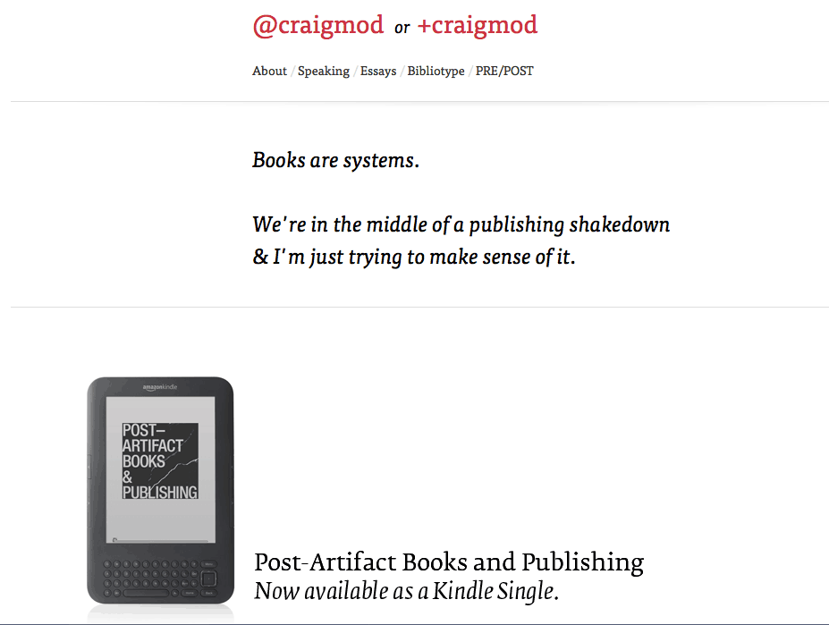
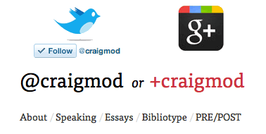
Craig Mod has a beautifully simple home page. His liberal use of whitespace makes things clear and it encourages you to scroll down and explore.
You'll notice how the further down you go, the denser the content gets -- the further you commit to exploring, the more content he gives you.
I also love how when you hover over his name at the top, you're presented with a clear way of connecting with him on Twitter and Google+.
I now had ideas for home page simplicity, but I still needed a way to present my latest work. Even though I had simplified my types of writing, I still had Essays, Journals, Thoughts, and Margin Notes to work with.
How could I display my recent work in a list format that was easy to read?
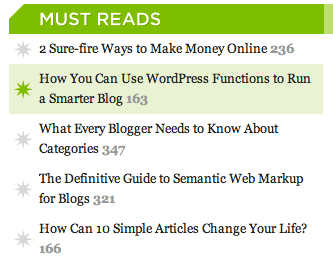
Chris Pearson's sidebar contains lists of various posts in beautifully color-coded sections. I love how the color of each section is reinforced when you hover over the items in that list. The angled cut on each header also makes them easier on the eyes.
Using those design ideas, I sat down yesterday and spent 10 hours redesigning my home page.
I tried Chris' colored headers, but I realized they were too loud for my style.
I didn't like Craig's Twitter and Google+ buttons at the top of the page, so I put mine at the bottom.
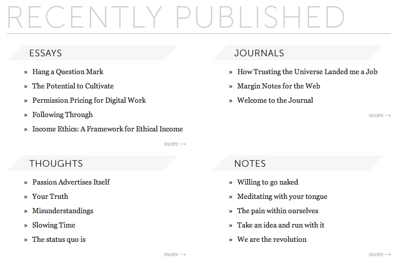

My home page now feels congruent with my core style of simplicity and cleanliness and it solves the problem of presenting my latest content. I started with a clean slate, took ideas that I loved from other designs, and added my own twist.
When it comes to design, much of what I create is inspired by something or someone else. When I come across a design or element of style that I find aesthetically appealing, I stop and ask myself why I find it appealing.
Understanding why something looks nice -- or why something is comfortable, or why something is easy to use -- not only helps me better understand good design, it also helps me understand myself.
I often tell people that I'm not a designer, but I'm beginning to believe that we're all designers in one way or another.
To design is to envision something that isn't there and then pull together pieces of the universe to create it. The more we understand ourselves and the world around us -- the more we release what we think we already know -- the better designers we will be.
This extends to other areas of life as well: If we don't understand why we do, or do not, enjoy something, then how can we effectively design our life?
If we don't know why we're writers, or coaches, or designers, or programmers, or explorers, or entrepreneurs, or connectors, or yoga teachers, how can we pull together the pieces of the universe necessary to live a life in harmony with what makes us who we are?