
After several drafts on my new tech blog mysteriously appeared publicly as published, I discovered that the new WordPress keyboard shortcut for Publish is the same as the Previous Tab shortcut in Vimperator (the Firefox plugin that allows me to browse the web using only the keyboard). Regardless of what mode I'm in (Insert mode or Normal mode), pressing CTRL+P publishes the post and switches to the previous tab.
User Interfaces
There are 13 posts tagged User Interfaces (this is page 1 of 1).
Zoomism: Navigate by Zooming
Zoomism allows you to navigate the site entirely by zooming. It's actually really fun and works quite well -- a lot more adventurous than scanning and clicking URLs on a page. The site is using Flash to make all this happen so obvious downsides exists (e.g., you cannot select text or easily save images), however I think there is real potential in this concept. I would love to have a tool that allowed me to generate a gigantic map of an entire website that I can explore by zooming!
Browsing the Web with only a Keyboard
The beauty and simplicity of the keyboard has always impressed me. As a kid, my Asian gaming friends taught me the importance of utilizing as much of the keyboard as possible (and the skill improvement was so great it often resulted in being accused of cheating). Many of the applications I use on a daily basis (which used to require a GUI) have been replaced by console-based, keyboard-only alternatives (in particular, instant messaging, email, IRC, and text editing). Each time I switched to a keyboard-only alternative, my productivity (and sanity) have improved immensely.
One application I thought would always require the assistance of my tailed friend was web browsing. While text-based browsers like Elinks and Lynx have made a fantastic effort, they simply don't allow for the rich browsing experience provided by a full browser like Firefox. I had come to accept that maybe the future of keeping my hands in one place was lost to the ever-growing web-based world.
And then, randomly and entirely by chance, I discovered a way to browse the web using nothing but my keyboard: Vimperator, a Firefox plugin that turns the browser into a fully keyboard-accessible interface using vim bindings. It solves the problem of needing to click links and buttons beautifully. Simply pressing the letter f while in command-mode tags all visible links with a number. Typing that number clicks the link or button (you can also just start typing part of a word in the link and then press enter).

It definitely takes some getting used to, but it is much faster than using a mouse! All the browser functionality is available through the keyboard, including tab management (I use tabs a lot). To open a new tab and type a URL, just press Esc to make sure you're in command-mode and then type t google.com. To close a tab, press d (think "delete-tab"). If you decide to try Vimperator and you freak out when your menu and address bar disappears, press Esc to get into command-mode and then type :set guioptions+=mT and press Enter. The :help section is very useful for learning more.
My purist mentality has often made me wonder if I could live entirely on the command line, or if everything I currently do in a GUI could at least be done without a mouse. I think it's more the latter than the former; it's about efficiency. Even when I'm using a mouse with the GUI, I find myself constantly searching for keyboard shortcuts. The mouse just feels so alien for anything but artistic stuff (i.e., working with shapes, graphics, etc) and gaming. It feels like a crutch; like a cane for someone with a typing disability.
I've been using Vimperator for two days now and I have already made several important observations regarding my web browsing usage. Without the mouse, I don't doodle. I don't scroll up and down pages randomly looking at stuff or skipping and then rereading text, all of which waste valuable time. Instead, I'm browsing more efficiently and with more purpose. Another thing I noticed (now that my mouse usage has almost dropped in half) is that when I do reach for the mouse my hand actually feels uncomfortable.
If you're a vim user, or you enjoy the command-line, give Vimperator a shot. You may find yourself very frustrated at first but try to stick with it for a few days and see how it changes your browsing habits. You may be in for a surprise.
A Realization that GUI Dependence can be Harmful
After an arduous three days without my laptop, I finally have it back in my possession. I managed to get by using an old Thinkpad running Linux, a Windows XP desktop, and a spare G4 Mac Mini running OS X (all three of which saw very, very little use while I had my MacBook Pro). Every bit of my email is stored server-side (IMAP) and any important files were accessible on a backup drive, so it was really only the computing environment that changed.
Despite only the environment changing however, I observed something interesting: I felt a lot less creative and even mentally (and perhaps even emotionally) handicapped without my laptop. It's the first time I can remember feeling that way from something as simple as a piece of electronic machinery. I'm convinced it was the graphical user interface (GUI) I became attached to and, being someone who hates feeling attached or in any way dependent, the experience has encouraged me to continue moving towards console-based solutions for my daily computing needs.
Maintaining things on a remote console means the environment will stay the same regardless of the computer I'm using to connect. The "computing environment" essentially becomes the console window itself. Advantages to using console-based programs are numerous, that is once you get past the learning curve. But the same way a one-finger typist isn't very productive until he learns to type, console-based apps won't allow you to be productive until you become familiar and comfortable with the environment.
For all real-time communication (IRC, AIM, and Jabber) I've switched to using screen + irssi + BitlBee. Previously, I was using irssi for IRC and Adium for instant messaging. For email, I've been meaning to set up mutt for quite some time, but both the complexity and my daily reliance on email have caused me to procrastinate.
But I realized my console-migration doesn't need to end with IRC, IM, and email. For example, when my coworker mentioned the idea of an IRC Twitter interface, I looked for one and discovered tircd, an IRC proxy to the Twitter API. This made me realize that even things like posting to my blog could be done through IRC with the right proxy (similar to the way I'm currently blogging from the command line). And if a particular IRC proxy does not exist, I can just as easily write one myself and share it with the community!
An Example of Bad HTML Form Usability
While recently reconfiguring a Netgear FVS-124G router I was astounded by the blatant misuse of HTML form elements. In the router configuration there was a list of services that were forwarded to various computers. (I would call it port forwarding but Netgear has its own way of doing things -- another usability mistake.) The router was being configured for a new office so none of the existing dozen-or-so entries were valid and needed to be removed.
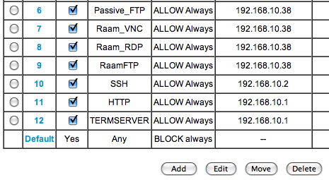
Since the list used Radio Buttons (wrong) instead of Check Boxes (correct), I was only able to select a single entry at a time, delete it, click Continue on the following confirmation page, and then return to the list to start the process all over again. Sure, the Radio Buttons could be a way to prevent someone from accidentally deleting a whole selection, but that's what confirmation boxes are for.
You'd think someone as big as Netgear would have gotten their act together by now and worked out some of these really silly usability issues. For that matter, they (along with Linksys) should do away with their interface all together and adopt DD-WRT!
Two useful iPhone features you might not know about
Here are two iPhone features I discovered entirely by accident and that I now find myself using several times a day. They're not terribly exciting, but you may find them useful if you're not already aware of them.
Easily Access the First Page of Apps
The first one appears to be a newly added feature included in the latest software update. If you have several pages of application icons on your iPhone, you may find yourself constantly going back to the first page to access things like the Camera, Calculator, or Safari apps (which cannot be moved from the first page). Now instead of flicking back through your 5, 10, or 15 (!) pages of apps to get to the first page, you can do it with one click.
Press the home button on the bottom of the phone one time to immediately go to the first page of apps.
Delete Email Gesture
The second feature is a little more interesting and it has been around for a while. I discovered it by accident while scrolling through my list of emails:
From the email list, you can use a single-finger gesture to bring up a delete button on a per-email basis. Simply flick your finger across an email to the left or right (I found going to the left works better) and a Delete button will show up next to the email (see screenshot below).

Browser Resolutions of the Interweb
I have often advocated designing websites to support as many screen resolutions and browsers as possible, including tiny mobile devices and text-based web browsers like Lynx (though I prefer Elinks myself). Whether I'm under-the-gun at work, or just designing a new WordPress theme for my blog, when time and resource constraints force me to decide on a minimum resolution I look for statistics to back up my choices. In a perfect world, all sites would be usable with all browser resolutions (and CSS would play nice with all browsers and 1px would be 1px... don't get me started).
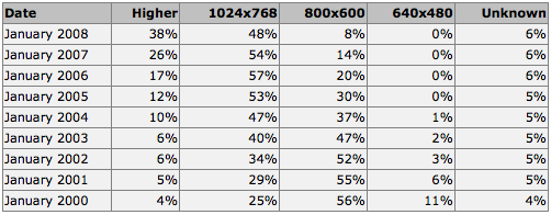
It wasn't too long ago that a lot of people were still browsing the web with an 800x600 screen resolution. For most of us now though, the only time we see that screen resolution is when we don't have the correct video drivers installed. W3Schools keeps lots of interesting web stats based upon visitors to their site, including Browser Display Statistics. Here you can follow a clear trend to higher browser resolutions through the years:
This lead me to check my the visitor browser resolutions for this blog through Google Analytics. I've been keeping stats on this blog since September 2007 and with over 40,000 visits I figured I could get some good metrics:
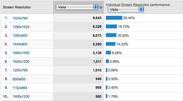
These stats seem to indicate the same thing as W3School's stats: 1024x768 is a clear winner. This got me thinking though. How many of the popular sites out there are viewable in 1024x768? What about 800x600, or even 640x480?
Yet Another Window Resizer is an excellent Firefox add-on that allows you to easily resize your browser to various resolutions. I visited various popular sites and tested their minimum browser resolutions:
[1024x768] - Amazon.com
[1024x768] - eBay
[1024x768] - Yahoo!
[1024x768] - Wikipedia
[1024x768] - CNN
[1024x768] - YouTube
[1024x768] - Apple
[1024x768] - Microsoft
[1024x768] - Digg
[1024x768] - Delicious
[1024x768] - Facebook
[800x600] - Twitter
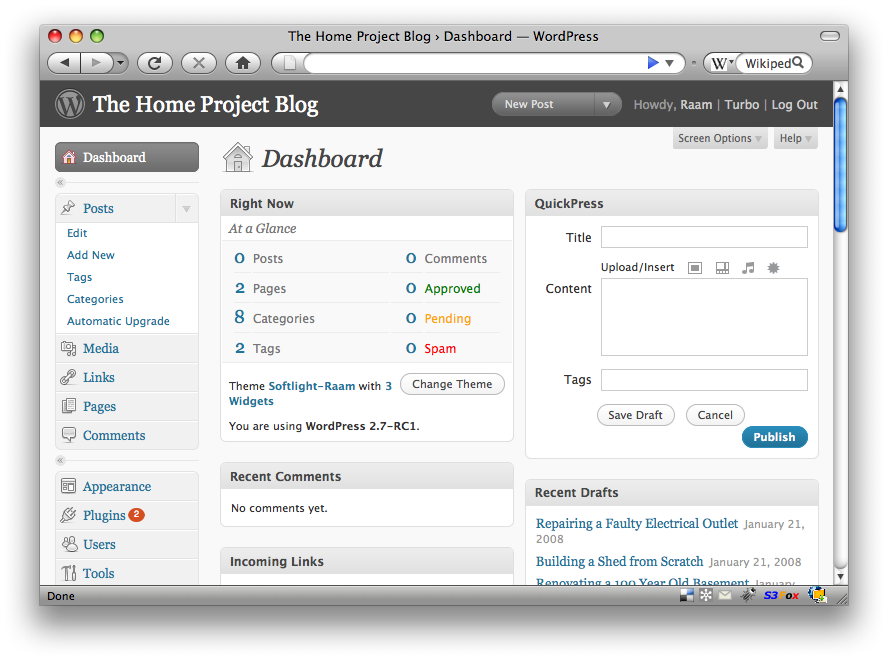
[800x600] - WordPress 2.7 Admin Dashboard (screenshot)
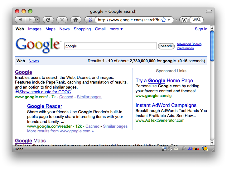
[640x480] - Google Search (screenshot)
[640x480] - Google News
[640x480] - Google Maps
Clearly most sites have chosen to ignore smaller browser resolutions in favor of supporting only the most popular as a minimum. (Although this blog has a 1024x768 minimum requirement, the main content area is fully visible in 800x600.) The nature of the content presented by the site dictates a lot of the size requirements. For example, Google search presents textual content that can easily be (and most certainly should be) confined to a small area. In fact, the Google search results maintain a 640px width even when you're using a much higher resolution (leaving a lot of white space to the right, but maintaining readability).
There is much to be said about textual readability on the web, but I'll leave that for another post.
HTML Radio Buttons: A blast from the past!
So there I was sitting in my C/Unix class at Harvard barely paying attention to the professor as he talked about HTML forms (!) when I heard him start talking about the history of the HTML radio button. I often wondered why they were called "radio" buttons so I shifted my attention and listened.
He started by trying to explain to a room full of people a third his age how car radios did not always have tiny touch-sensitive buttons and that they used to be single mechanical buttons that when one was pressed, the other would come out (much like the old cassette-based walkman's).
This little fact fascinated me because I have been using HTML radio buttons for so long and until now, I have been so oblivious to the history behind their name. A quick search on Wikipedia confirmed my professor's story:
A radio button or option button is a type of graphical user interface widget that allows the user to choose one of a predefined set of options. They were named after the physical buttons used on car radios to select preset stations - when one of the buttons was pressed, other buttons would pop out, leaving the pressed button the only button in the "pushed in" position.
Google Autocomplete for Search
I just noticed the main Google page now has autocompletion for the search box:

The feature, called Google Suggest, has been in the Labs for awhile. It "graduated" to the main front page almost exactly one week ago.
This is going to make it easy and lots of fun to check the most popular search term for a particular topic!
Could this be the future of touchpads?
A multi-touch color screen touchpad using the same touchscreen as the iPhone? It could replace the OS X dock and provide a whole new method of interacting with your computer! Fingerprint security device, electronic signature pad, an electronic sketch pad for better photo editing accuracy... the possibilities are endless!
Fixing Boot-Time Dialog Display Issues
Dialog is a really useful utility for creating professional looking dialog boxes and menus within a shell script. I'm working on a boot-time script that allows the user to make system-level changes before the system has fully booted.
When testing my script from the command line, the dialog menu looked fine. However, whenever I set the script to start during boot (update-rc.d myscript.sh defaults, on Debian-based systems) here is what the menu looked like:
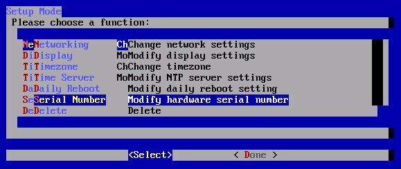
UGH! It was barely usable. At first, I thought this would be an endlessly difficult problem to solve given my limited in-depth knowledge of Linux (I'm getting there!), but then I realized the main difference between the script running during boot and the script running after I had logged in was that my environment variables had not been loaded.
From the command line, I ran the env command to display all my current environment variables:
debian_vm:~# env
TERM=xterm-color
SHELL=/bin/bash
SSH_CLIENT=172.16.168.1 61315 22
SSH_TTY=/dev/pts/0
USER=root
MAIL=/var/mail/root
PATH=/usr/local/sbin:/usr/local/bin:/usr/sbin:/usr/bin:/sbin:/bin:/usr/bin/X11
PWD=/root
LANG=en_US.UTF-8
PS1=h:w$
SHLVL=1
HOME=/root
LANGUAGE=en_US:en_GB:en
LOGNAME=root
SSH_CONNECTION=172.16.168.1 61315 172.16.168.132 22
_=/usr/bin/env
The three variables that caught my eye were TERM, SHELL, and LANG. After a little trial and error, I discovered setting the LANG variable fixed the display issues with dialog! I added the following near the top of my script:
export LANG=en_US.UTF-8
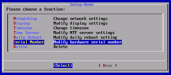
Now when my script loads during boot, everything looks correct:
Yamaha TENORI-ON – A touch-sensitive sequencer
reactable – A tabletop tangible multi-touch interface
A little old (in the technology world anyway), but still very cool. More YouTube videos of reactable in action.
Official site: reactable.iua.upf.edu