I have often advocated designing websites to support as many screen resolutions and browsers as possible, including tiny mobile devices and text-based web browsers like Lynx (though I prefer Elinks myself). Whether I'm under-the-gun at work, or just designing a new WordPress theme for my blog, when time and resource constraints force me to decide on a minimum resolution I look for statistics to back up my choices. In a perfect world, all sites would be usable with all browser resolutions (and CSS would play nice with all browsers and 1px would be 1px... don't get me started).
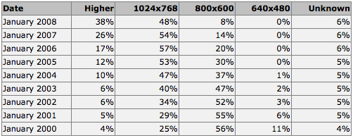
It wasn't too long ago that a lot of people were still browsing the web with an 800x600 screen resolution. For most of us now though, the only time we see that screen resolution is when we don't have the correct video drivers installed. W3Schools keeps lots of interesting web stats based upon visitors to their site, including Browser Display Statistics. Here you can follow a clear trend to higher browser resolutions through the years:
This lead me to check my the visitor browser resolutions for this blog through Google Analytics. I've been keeping stats on this blog since September 2007 and with over 40,000 visits I figured I could get some good metrics:
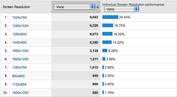
These stats seem to indicate the same thing as W3School's stats: 1024x768 is a clear winner. This got me thinking though. How many of the popular sites out there are viewable in 1024x768? What about 800x600, or even 640x480?
Yet Another Window Resizer is an excellent Firefox add-on that allows you to easily resize your browser to various resolutions. I visited various popular sites and tested their minimum browser resolutions:
[1024x768] - Amazon.com
[1024x768] - eBay
[1024x768] - Yahoo!
[1024x768] - Wikipedia
[1024x768] - CNN
[1024x768] - YouTube
[1024x768] - Apple
[1024x768] - Microsoft
[1024x768] - Digg
[1024x768] - Delicious
[1024x768] - Facebook
[800x600] - Twitter
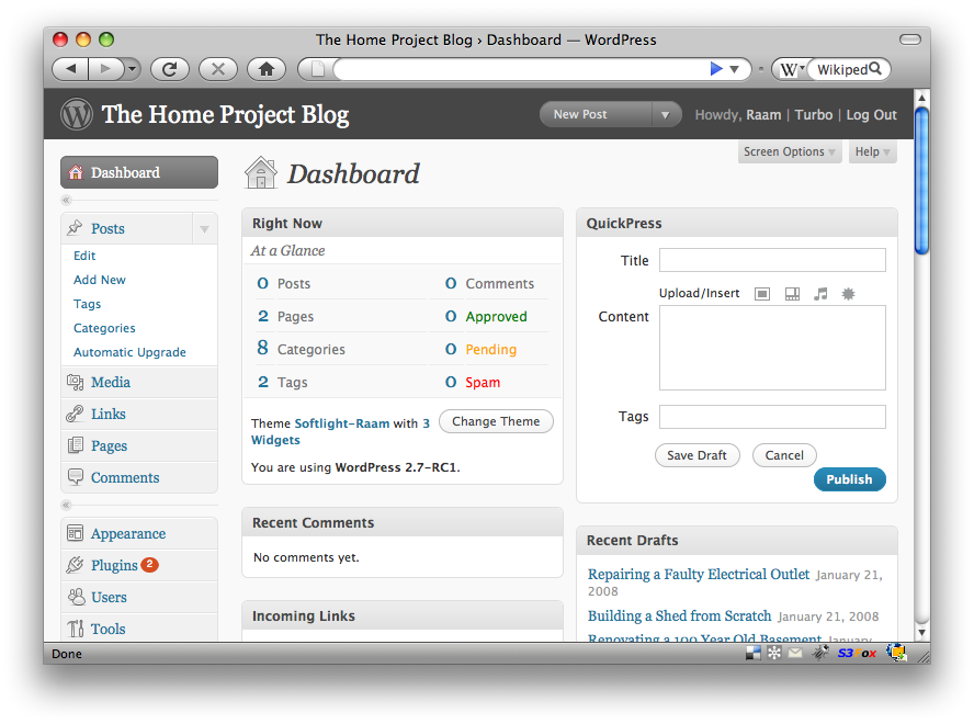
[800x600] - WordPress 2.7 Admin Dashboard (screenshot)
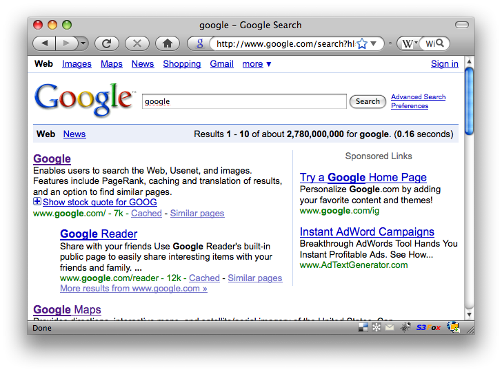
[640x480] - Google Search (screenshot)
[640x480] - Google News
[640x480] - Google Maps
Clearly most sites have chosen to ignore smaller browser resolutions in favor of supporting only the most popular as a minimum. (Although this blog has a 1024x768 minimum requirement, the main content area is fully visible in 800x600.) The nature of the content presented by the site dictates a lot of the size requirements. For example, Google search presents textual content that can easily be (and most certainly should be) confined to a small area. In fact, the Google search results maintain a 640px width even when you're using a much higher resolution (leaving a lot of white space to the right, but maintaining readability).
There is much to be said about textual readability on the web, but I'll leave that for another post.
One of your 1440×900 viewers… well from the home PC