While recently reconfiguring a Netgear FVS-124G router I was astounded by the blatant misuse of HTML form elements. In the router configuration there was a list of services that were forwarded to various computers. (I would call it port forwarding but Netgear has its own way of doing things -- another usability mistake.) The router was being configured for a new office so none of the existing dozen-or-so entries were valid and needed to be removed.
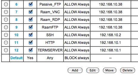
Since the list used Radio Buttons (wrong) instead of Check Boxes (correct), I was only able to select a single entry at a time, delete it, click Continue on the following confirmation page, and then return to the list to start the process all over again. Sure, the Radio Buttons could be a way to prevent someone from accidentally deleting a whole selection, but that's what confirmation boxes are for.
You'd think someone as big as Netgear would have gotten their act together by now and worked out some of these really silly usability issues. For that matter, they (along with Linksys) should do away with their interface all together and adopt DD-WRT!