Browsing the Web with only a Keyboard

The beauty and simplicity of the keyboard has always impressed me. As a kid, my Asian gaming friends taught me the importance of utilizing as much of the keyboard as possible (and the skill improvement was so great it often resulted in being accused of cheating). Many of the applications I use on a daily basis (which used to require a GUI) have been replaced by console-based, keyboard-only alternatives (in particular, instant messaging, email, IRC, and text editing). Each time I switched to a keyboard-only alternative, my productivity (and sanity) have improved immensely.

One application I thought would always require the assistance of my tailed friend was web browsing. While text-based browsers like Elinks and Lynx have made a fantastic effort, they simply don't allow for the rich browsing experience provided by a full browser like Firefox. I had come to accept that maybe the future of keeping my hands in one place was lost to the ever-growing web-based world.

And then, randomly and entirely by chance, I discovered a way to browse the web using nothing but my keyboard: Vimperator, a Firefox plugin that turns the browser into a fully keyboard-accessible interface using vim bindings. It solves the problem of needing to click links and buttons beautifully. Simply pressing the letter f while in command-mode tags all visible links with a number. Typing that number clicks the link or button (you can also just start typing part of a word in the link and then press enter).

Firefox using the Vimperator plugin

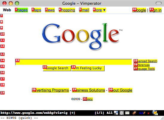
It definitely takes some getting used to, but it is much faster than using a mouse! All the browser functionality is available through the keyboard, including tab management (I use tabs a lot). To open a new tab and type a URL, just press Esc to make sure you're in command-mode and then type t google.com. To close a tab, press d (think "delete-tab"). If you decide to try Vimperator and you freak out when your menu and address bar disappears, press Esc to get into command-mode and then type :set guioptions+=mT and press Enter. The :help section is very useful for learning more.

My purist mentality has often made me wonder if I could live entirely on the command line, or if everything I currently do in a GUI could at least be done without a mouse. I think it's more the latter than the former; it's about efficiency. Even when I'm using a mouse with the GUI, I find myself constantly searching for keyboard shortcuts. The mouse just feels so alien for anything but artistic stuff (i.e., working with shapes, graphics, etc) and gaming. It feels like a crutch; like a cane for someone with a typing disability.

I've been using Vimperator for two days now and I have already made several important observations regarding my web browsing usage. Without the mouse, I don't doodle. I don't scroll up and down pages randomly looking at stuff or skipping and then rereading text, all of which waste valuable time. Instead, I'm browsing more efficiently and with more purpose. Another thing I noticed (now that my mouse usage has almost dropped in half) is that when I do reach for the mouse my hand actually feels uncomfortable.

If you're a vim user, or you enjoy the command-line, give Vimperator a shot. You may find yourself very frustrated at first but try to stick with it for a few days and see how it changes your browsing habits. You may be in for a surprise.

Instant Word Definitions on the NYTimes Website

The New York Times has a great website. One feature I accidentally discovered today (although I believe it has existed for several months) allows you to select any word from within an article and bring up the definition of the word. The feature uses this Javascript to place a little question mark icon next to the word when you select it:

New York Times Dictionary Lookup

Clicking the question mark opens a new window with the definition and even an encyclopedia entry (if one exists) using a Reference Search powered by Answers.com.

Some would argue (and I would tend to agree) that such a feature should be left to be implemented in a browser extension. Never the less, it's a really cool feature and it reminded me how much of an effect technology is having on print publications. Just think, 20 years ago reading the newspaper and instantly getting the definition of a word by selecting it would have been science fiction.

An Example of Bad HTML Form Usability

While recently reconfiguring a Netgear FVS-124G router I was astounded by the blatant misuse of HTML form elements. In the router configuration there was a list of services that were forwarded to various computers. (I would call it port forwarding but Netgear has its own way of doing things -- another usability mistake.) The router was being configured for a new office so none of the existing dozen-or-so entries were valid and needed to be removed.

Bad Netgear Usability

Since the list used Radio Buttons (wrong) instead of Check Boxes (correct), I was only able to select a single entry at a time, delete it, click Continue on the following confirmation page, and then return to the list to start the process all over again. Sure, the Radio Buttons could be a way to prevent someone from accidentally deleting a whole selection, but that's what confirmation boxes are for.

You'd think someone as big as Netgear would have gotten their act together by now and worked out some of these really silly usability issues. For that matter, they (along with Linksys) should do away with their interface all together and adopt DD-WRT!

Two useful iPhone features you might not know about

Here are two iPhone features I discovered entirely by accident and that I now find myself using several times a day. They're not terribly exciting, but you may find them useful if you're not already aware of them.

Easily Access the First Page of Apps

The first one appears to be a newly added feature included in the latest software update. If you have several pages of application icons on your iPhone, you may find yourself constantly going back to the first page to access things like the Camera, Calculator, or Safari apps (which cannot be moved from the first page). Now instead of flicking back through your 5, 10, or 15 (!) pages of apps to get to the first page, you can do it with one click.

Press the home button on the bottom of the phone one time to immediately go to the first page of apps.

Delete Email Gesture

The second feature is a little more interesting and it has been around for a while. I discovered it by accident while scrolling through my list of emails:

From the email list, you can use a single-finger gesture to bring up a delete button on a per-email basis. Simply flick your finger across an email to the left or right (I found going to the left works better) and a Delete button will show up next to the email (see screenshot below).

Moved comment and date underneath post title

In attempt to fix a slight usability issue with this blogs' theme that caused the post comments link to appear that it might belong to the previous post, I moved the comments and date line underneath the post title (as opposed to above it) and adjusted the spacing to bring the two closer together.

Browser Resolutions of the Interweb

I have often advocated designing websites to support as many screen resolutions and browsers as possible, including tiny mobile devices and text-based web browsers like Lynx (though I prefer Elinks myself). Whether I'm under-the-gun at work, or just designing a new WordPress theme for my blog, when time and resource constraints force me to decide on a minimum resolution I look for statistics to back up my choices. In a perfect world, all sites would be usable with all browser resolutions (and CSS would play nice with all browsers and 1px would be 1px... don't get me started).

It wasn't too long ago that a lot of people were still browsing the web with an 800x600 screen resolution. For most of us now though, the only time we see that screen resolution is when we don't have the correct video drivers installed. W3Schools keeps lots of interesting web stats based upon visitors to their site, including Browser Display Statistics. Here you can follow a clear trend to higher browser resolutions through the years:

Browser Display Statistics

This lead me to check my the visitor browser resolutions for this blog through Google Analytics. I've been keeping stats on this blog since September 2007 and with over 40,000 visits I figured I could get some good metrics:

raamdev.com Visitor Screen Resolutions

These stats seem to indicate the same thing as W3School's stats: 1024x768 is a clear winner. This got me thinking though. How many of the popular sites out there are viewable in 1024x768? What about 800x600, or even 640x480?

Yet Another Window Resizer is an excellent Firefox add-on that allows you to easily resize your browser to various resolutions. I visited various popular sites and tested their minimum browser resolutions:

[1024x768] - Amazon.com
[1024x768] - eBay
[1024x768] - Yahoo!
[1024x768] - Wikipedia
[1024x768] - CNN
[1024x768] - YouTube
[1024x768] - Apple
[1024x768] - Microsoft
[1024x768] - Digg
[1024x768] - Delicious
[1024x768] - Facebook
[800x600] - Twitter
[800x600] - WordPress 2.7 Admin Dashboard (screenshot)
[640x480] - Google Search (screenshot)
[640x480] - Google News
[640x480] - Google Maps

Clearly most sites have chosen to ignore smaller browser resolutions in favor of supporting only the most popular as a minimum. (Although this blog has a 1024x768 minimum requirement, the main content area is fully visible in 800x600.) The nature of the content presented by the site dictates a lot of the size requirements. For example, Google search presents textual content that can easily be (and most certainly should be) confined to a small area. In fact, the Google search results maintain a 640px width even when you're using a much higher resolution (leaving a lot of white space to the right, but maintaining readability).

There is much to be said about textual readability on the web, but I'll leave that for another post.

Not Outsourcing my Comments to IntenseDebate

I've been hearing a lot about IntenseDebate recently, in various blog posts and news sites (they were acquired by Automattic, the company behind WordPress, back in September). IntenseDebate is basically a set of tools that allows for enhanced commenting on your blog or website. Two features that caught my attention were Comment Threading and Reply-by-email.

Comment Threading was of particular interest to me because I find that being able to respond directly to a specific comment keeps the comments organized and relevant. Normally the way you respond directly to a comment without threading support is to prefix your reply with the persons name (e.g., "@raamdev That's a great idea!"), but constantly searching the list of comments for the comment being replied to gets tiresome.

I don't really have enough comment traffic on this blog to deal with the aforementioned problem on a regular basis, but I decided to install the IntenseDebate WordPress plugin to see how easily I could integrate it. I was impressed with how smoothly the process went. All my old comments (1,300+) were synced to IntenseDebate and there was nothing I needed to change on my theme templates -- the entire commenting system was replaced with IntenseDebate's commenting system, with threading support, a comment reputation point system, and all those other fancy features.

In the end, however, I decided to deactivate the plugin. I didn't like that my comments were being loaded from an outside source, which both increased the average load time for each page and added yet another dependency on an external service. (In contrast, my Twitter sidebar uses Twitter Tools, which actually syncs tweets to the same database as WordPress and loads them from there. Dependency problems solved! To be fair though, the IntenseDebate plugin maintains a copy of all the comments in the WordPress database, just in case you decide to stop using it.) Customizing the look and feel of the comments also meant modifying CSS through my IntenseDebate account and right from the start I felt the need to customize and make the comment system less "busy" and self-advertising. There were no themes to choose from either. Ugh.

While doing all this thinking about the disadvantages of outsourcing my comments, I came across a post on Robert Nystorm's blog where he decides to literally outsource all of his comments. Instead of having any form of commenting system, he simply provides a link to reddit, Digg, and StumbleUpon where he encourages people post their comments on his post. His rationale behind this is that people already use these other sites for commenting and those commenting systems are specifically tuned to handle comments. If you can't beat'em, join'em.

But that's extreme. Although I can sympathize with some of Robert's frustration, I think a commenting system, even if only a simple one, is important. While some people may be familiar with reddit, Digg, and StumbleUpon, not everyone will use those sites regularly or, for that matter, want to go through the trouble of creating an account just to post a comment.

Back in September, I wrote about how excited I was to hear that Comment Threading was coming in WordPress 2.7. I hope the features and functionality of IntenseDebate are somehow integrated into WordPress down the road, instead of indefinitely relying on an external service to provide the same functionality.

Google's Growing Visual Clutter

Google's latest "feature" is nothing short of annoying. I fell in love with Google Search for the clean, textual layout of the search results. The colored text I can deal with, but not visual buttons next to every single result! To make matters worse, Google doesn't provide a way to disable this feature either, so your only two options are logging out of your Google account or installing a Greasemonkey extension.

Oh, and my rant doesn't end there. Another feature that was recently added, Google Suggest, has been more trouble than it has help. I can't even count how many times I've went to Google something only to have a big list of suggestions instantly erase the original search query from my head. There are hacky ways to disable that too, but come on Google! There should be options to disable this stuff!

HOWTO: Exclude songs when shuffling iTunes

I have a bunch of audio books and other non-music files in my iTunes library. When I set iTunes to shuffle through the songs in my library it naturally ends up playing one of those non-music files, causing me to stop whatever I'm doing and advance iTunes to the next song (using my iPhone remote, ha!).

When I realized how common a problem this must be for people, I looked around the settings in iTunes for a solution. Sure enough, you can tell iTunes to skip a file when shuffling! Just select the file (or group of files), right click, and choose Get Info -> Options -> Skip when shuffling.

Googlebot Relentlessly Using Bandwidth

When one of my hosting clients complained about continuously running out of bandwidth on his low-traffic site, I took a peek at the access logs and discovered that Googlebot was indexing every single possible day on a simple calendar addon for the phpBB2 forum software installed on the site. (Googlebot is the program that crawls the web indexing everything so you can search for it using Google.)

A quick peek at the access logs showed thousands of Googlebot requests for a forum calendar:

[sourcecode language="bash"]
66.249.71.39 - - [01/Sep/2008:17:09:12 -0400] "GET /forums/calendar.php?m=7&d=21&y=1621&sid=79b643b30eer7140adcd2ba76732688a HTTP/1.1" 200 44000 "-" "Mozilla/5.0 (compatible; Googlebot/2.1; +http://www.google.com/bot.html)"
66.249.71.40 - - [01/Sep/2008:17:09:33 -0400] "GET /forums/calendar.php?m=4&d=2&y=2188&sid=e4da1ee0a488096e3897a8f15c31cea2 HTTP/1.1" 200 43997 "-" "Mozilla/5.0 (compatible; Googlebot/2.1; +http://www.google.com/bot.html)"
66.249.71.40 - - [01/Sep/2008:17:09:44 -0400] "GET /forums/calendar.php?m=12&d=4&y=1624&sid=cc5d5084d158457ce3c7a9d38263f553 HTTP/1.1" 200 44076 "-" "Mozilla/5.0 (compatible; Googlebot/2.1; +http://www.google.com/bot.html)"
66.249.71.41 - - [01/Sep/2008:17:10:05 -0400] "GET /forums/calendar.php?m=10&d=15&y=1621&sid=a4e8af0d20715g965b3e616ae6f95004 HTTP/1.1" 200 43751 "-" "Mozilla/5.0 (compatible; Googlebot/2.1; +http://www.google.com/bot.html)"
66.249.71.41 - - [01/Sep/2008:17:10:15 -0400] "GET /forums/calendar.php?m=9&d=13&y=2187&sid=80c79b2491ddf3d8d46076d48a6282d1 HTTP/1.1" 200 43896 "-" "Mozilla/5.0 (compatible; Googlebot/2.1; +http://www.google.com/bot.html)"
66.249.71.40 - - [01/Sep/2008:17:10:26 -0400] "GET /forums/calendar.php?m=5&d=30&y=1618&sid=f0619ba6517an57bcd6a7e9ca6289a32 HTTP/1.1" 200 43820 "-" "Mozilla/5.0 (compatible; Googlebot/2.1; +http://www.google.com/bot.html)"
66.249.71.39 - - [01/Sep/2008:17:10:38 -0400] "GET /forums/calendar.php?m=11&y=2189&d=30&sid=97c0a58bbd2b3914dbf255ea0a2b1a4c HTTP/1.1" 200 44107 "-" "Mozilla/5.0 (compatible; Googlebot/2.1; +http://www.google.com/bot.html)"
[/sourcecode]

A quick Google search turned up many others who've had the same problem:

Just found exactly the same on one of my client’s sites. They were complaining that despite being a small site, they’d apparently used all of their bandwidth within 4 days.

They had one of these PHP calendars on their site, where you click the day and it tells you what’s on. Googlebot had tried to index EVERY SINGLE POSSIBLE DAY. And, in the first four days of September, had used up all this site’s bandwidth, clocking up an impressive 19,000 hits and 800MB of bandwidth.

You can use robots.txt to tell all decent robots to push off. I’ve just done that. Let’s see if it works!

So I added a file to the root web directory for the site and named it robots.txt. Inside, I put the following:

User-agent: *
Disallow: /forums/calendar.php

Sure enough, the next time the Googlebot came through it ignored /forums/calendar.php and didn't use up ridiculous amounts of bandwidth indexing something that need not be indexed.

I can't blame the Googlebot though. It was just doing its job. The fault goes to the creators of the calendar addon. What they should have done was add a rel="nofollow" to all the links in the calendar. You can add a nofollow tag to individual links to prevent Googlebot from crawling them. Google started using the nofollow tag as a method of preventing comment spam back in 2005.

Boston FU: Retractable Earbud Hack

The first Boston Freehacker's Union meeting was tonight at Trident Cafe. FU rule #3 states,

Everyone who attends has to eventually show something they did. Not something someone else did. This is your time to give a performance, not to teach people how to use something so you get a book deal.

I didn't really have anything to show, but I wanted to show something. Tangled earbuds are one of the things that have been bugging me for, literally, years. (I prefer real headphones, but sometimes size matters.)

Every time I take the earbuds out of my bag, they're all tangled and I have to spend 30 seconds or so untangling them. I wanted something like the retractable cables in my Belkin 7-in-1 Retractable Cable Travel Pack, but for my Apple earbuds. Well, here's my 30 minute retractable earbud hack:

Retractable Earbud Hack

The most interesting part about this hack was what I learned about the locking mechanism. The recoil system was very simple; a twisted metal coil that increases tension as it is twisted. However, as you pull the wire out of the coil, something stops the device from retracting.

Retractable Earbud Hack - Ball Bearing Track

That something turned out to be a tiny metal ball bearing, sitting inside the funny looking track on top of the spinning center coil. The single straight track on the top stationary cover sandwiches the ball bearing inside the track and keeps the ball bearing in place. I actually lost the ball bearing twice and ended up taking apart all three of the retractable cables that came with the Belkin kit.

There's definitely lots of room for improvement. A removable retractable device would be much nicer and the size and weight is also an issue. The guys I met at the FU meeting seemed to like it and I'm definitely going to keep using it whenever I use the earbuds. I'll add any further observations to the bottom of this post.

iCal Missing AM/PM Option? Change to 24-hour Mode!

Am I crazy or is there no way to make iCal show AM/PM when editing a calendar entry?

iCal Missing AM/PM Option

The AM/PM option IS there, because if I use the arrow key to move over to next field, there's a hidden AM/PM field which I can change. However, unless I know what it's already set to, I have no way of knowing what I'm changing it to. Very annoying.

My fix for this is to simply use 24-hour mode, which I already use on my main system clock anyway. (By the way, if you have trouble converting 24-hour time to 12-hour time, you might want to check out my post on Learning to Interpret Military Time.) Unfortunately, enabling the "Use a 24-hour clock" option in the Date & Time settings does not enable 24-hour clock mode in iCal. To do this, you must modify the International settings (!?).

System Preferences -> International -> Formats -> Times -> Customize

Changing time format

From here, you can select and delete the AM/PM option from the white field and then click the little arrow on the hour field to change it's format to 24-hour (this screen is very non-intuitive for something made by Apple). I made the changes to Short, Medium, Long, and Full time formats and then clicked OK and WHAM! iCal showed 24-hour time and made it possible to easily change the time on an entry.

iCal 24-hour format

Firefox 3 Bug: Warn me when closing multiple tabs

When I started using the beta version of Firefox 3, I quickly discovered a bug (which remains in RC1): Even though I had enabled the "Warn me when closing multiple tabs" option (Preferences -> Tabs), Firefox did not give me any warning when I accidentally pressed Cmd+Q. It would just quit without a prompting me, even if I had 15 tabs open!

In Firefox 2, enabling "Warn me when closing multiple tabs" option would cause this prompt to appear whenever I pressed Cmd+Q:

Firefox 2 Warn on Close

I searched Bugzilla@Mozilla for an open bug regarding this problem and quickly found Bug 422040 - Quit Firefox 3 beta 4 does not give "closing multiple tabs" warning. I commented about my own experience regarding this bug and further confirmed its existence in Firefox 3 RC1.

Finally, Paul O'Shannessy explained in comment #24 how the warn on close functionality works in Firefox 3:

Do you have the start up behavior to restore tabs & windows from last time?
If so, when you quit (cmd-Q) the dialog regarding save session will not show
and Firefox will quit. Session will be restored upon starting Firefox.

This used to bug me until I thought about it more. Perhaps a dialog confirming
that you intended to quit is in store for this case, but that would be a
different bug. On the plus side, if you hit cmd-Q by accident your session
should restore.

So basically, if you want to be warned when closing multiple tabs in Firefox 3, you need to make sure your "When Firefox starts" option (Preferences -> Main) is set to "Show my home page" and not "Show my windows and tabs from last time". Setting it to the latter prevents the warning dialog when using Cmd+Q (however, you will get the warning if you try to close Firefox by pressing the X icon with your mouse).

To further confuse things, the warning dialog that comes up has a "Save and Quit" button. This button saves and restores your tabs the next time Firefox starts, which overrides your "When Firefox starts" setting of "Show my home page".

Firefox 3 Warn on Close

Talk about inconsistent behavior. Even though this bug seems to be limited to Mac OS X, I really hope it gets fixed in the final release. But if it doesn't get fixed, I'm glad it's at least possible to get the warning dialog when pressing Cmd+Q and that you can choose to "Save and Quit", even if it means making silly changes to the "When Firefox starts" option.

Workaround

One of the commenters mentioned the following workaround. I tested it with Firefox 3.5.7 on OS X 10.6.2 and it works perfectly:

  1. Install the Session Manager Plugin
  2. After restarting firefox, Go to Tools > Addons > Session Manager > Preferences
  3. Under General, set “At Shutdown” to "Ask whether to back up the current session"

Case Sensitivity in Mac OS X

Case sensitivity in Mac OS X does not exist.

The OS X command line is probably the most commonly used feature of my MacBook Pro. I love the fact that almost all the Linux commands I'm used to using on a Linux box work the same way in OS X. So, as you can imagine, I was shocked when I couldn't rename a simple directory:

eris:~ raam$ mv Downloads/ downloads/
mv: cannot move `Downloads' to a subdirectory of itself, `downloads/Downloads'

That command should allow me to rename 'Downloads' to 'downloads', but apparently OS X thinks 'Downloads' and 'downloads' are the same thing! That's absurd! In the Unix world, case matters!

So how did I eventually rename it?

eris:~ raam$ mv Downloads/ downloads2/
eris:~ raam$ mv downloads2/ downloads/

That's just ridiculous.

I installed the Fluxbox window manager on my MacBook Pro a while back and decided to start it up to make sure I had access to a "real" command line. Sure enough, the command worked as expected within Fluxbox. Maybe I'll start using Fluxbox a lot more often.

Check out this snippet from an article on InformIT:

Mac OS X, like the classic Mac OS before it, is not case sensitive; it doesn't care whether you said File1.txt or file1.txt. Only one of them can exist in a folder at the same time, and there's no ambiguity for either computers or humans in telling which file you meant. Even Unix commands like ls will work if you give them filenames to operate on that don't match the capitalization of the actual files (try it: ls /library).

That's really quite disappointing. I have suddenly lost so much respect for the OS X command line. Being derived from BSD in the Unix world, you would think Apple would keep something as fundamental as case sensitivity in OS X.

Apple's home page not viewable in 1024×768

Apple's Site Requires 1280x1024

I do all my browsing with my web browser resized to 1024x768, mainly because I don't need the window to take up the whole screen, but also because I like to see how compatible sites are with lower resolutions. As you can see from the screenshot above, Apple's home page is not fully viewable in 1024x768.

According to Google Analytics, 30% of all the visitors to my blog are browsing with a screen resolution of 1024x768. I'm not alone: According to W3Schools 48% of their visitors are browsing their site with 1024x768.

Come on Apple, don't lose sight of usability!

What form errors?

I tried creating an account on the Mozilla Firefox AddOn site and got this error:

It would definitely be helpful if it could tell me what error it's referring to, because I have no idea what it's talking about. I triple checked that the passwords match and even tried a non-free email address. No dice.

Minor Thunderbird Change Reduces my Productivity!

It's quite annoying when a new version of software is released and the programmers modify the menus, specifically the context menus. In Thunderbird 2.0, for example, they changed the context menu quite a bit from previous versions. I constantly use Thunderbird's context menu to "Mark Folder Read" and I used to instinctively know exactly how much to move my mouse after right clicking. Since they've changed the menu I have to stop and actually look at it.

Ignore the fact that the mouse is selecting "Empty Trash" in the following pictures. I couldn't find a picture of the old context menu showing Mark Folder Read selected.

Prior to Thunderbird 2.0:

Thunderbird 2.0:

Now really, why did it need to change that much? They only added two additional items! Talk about reducing productivity with minor changes to a commonly used GUI!

Windows and OSX Folder Replacement: Different!

In Windows, when drag and drop a folder into another folder that contains a folder with the same name, Windows asks you the following:

If you do the same thing on Mac OSX, you are prompted with a similar warning and question:

Notice the title of the Windows dialog box? It says "Confirm Folder Replace". See the OSX dialog box? It says "Copy". Now, you'd think that answering "Yes" in Windows and "Replace" in OSX would do the same thing, right? Well they don't!

In OSX, the folder is "Replaced" by the contents of the folder you are moving. So lets say you have a folder called "My Photos". Inside there you have a folder called "2006 Pictures". You also created a folder on your Desktop called "2006 Pictures" and you just finished moving pictures from your digital camera to the folder on your Desktop. When you're finished deciding which pictures to keep and which to throw away, you drag the "2006 Pictures" folder into your "My Photos" folder. Since there's already a "2006 Pictures" folder in there with all the other pictures from that year, you are asked what to do.

In Windows, if you choose "Yes" or "Yes to All", your pictures are simply added to the existing "2006 Pictures" folder; any pictures that were already in there will remain there (assuming they don't have the same name as the files you're moving). In Mac OSX however, choosing replace would remove the current "2006 Pictures" folder and replace it with the one you're moving! You would lose all your other pictures from that year and the "2006 Pictures" folder would only contain the images you just got off your camera!

It took me about an hour to figure this out. I was installing Eclipse on my MacMini and then adding the PHPEclipse plugin. To add the plugin, you simply have to copy two folders into your Eclipse installation folder. On my Windows PC's, I just dragged and dropped, so when I did the same on the Mac, I expected the same result. Every time I tried launching Eclipse after installing the plugin, I would receive all kinds of errors. I finally figured out it was because all the default plugins that are required for Eclipse to run, were being replaced by a plugins folder that contained nothing but the PHPEclipse plugin!